"21 Amžius" – a real estate partner you can trust

ABOUT THE CLIENT

Customer
21 amžius
Field
Real estate
Year
2025-2026

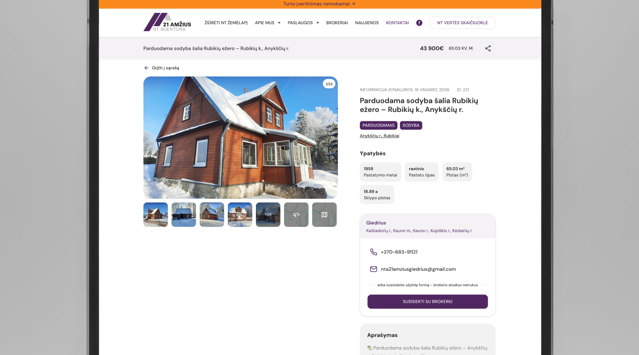
“21 Amžius” is an agency operating in the real estate market for more than 10 years, seeking to modernize its image and strengthen trust in the digital space.

Before the project:

  • the website functioned as an ad catalog,
  • there was a lack of clear value communication,
  • brokers were not highlighted as experts,
  • the range of services was not clearly structured.

The main goal is to create a modern, convenient and reliable website that would generate inquiries and clearly communicate the agency’s professionalism.

Strategic decision

Instead of a typical real estate map as the main element, the home page structure was redesigned to:

  • clearly demonstrate the agency’s scope,
  • present brokers as local experts,
  • communicate values ​​and social responsibility,
  • integrate partners and social proof.

The website became not only a catalog of objects, but also a platform of trust.

Process

01
Consultation
02
Needs analysis
03
Design
04
Design reviews
05
Programming
06
Launching
Phone frame
Phone screen content

UX solutions

  • filter by broker,
  • the ability to search by purpose (buy / rent),
  • interactive NT map with real-time filtering.

This allows different types of users to find relevant information quickly.

Internal pages of objects

On the internal pages, information is grouped by priority:

  • clearly visible broker and contacts,
  • multiple contact methods,
  • sticky navigation bars,
  • technical information – for those who scan,
  • emotional description – for “dreamers”,
  • Google Maps and Street View integrations.

Conversion architecture

  • request form is available from all major segments,
  • clear CTA blocks,
  • the service structure is built according to user scenarios,
  • FAQ with keyword search (SEO + for user convenience).

Brand positioning

In search of uniqueness in the competitive real estate market, the idea of ​​a stress-free process became a strategic starting point.

The stress ball house souvenir has become a metaphor:

  • NT process without tension,
  • clear answers,
  • support from the first question to the notary.

The combination of purple and orange distinguishes the agency in the market and communicates:

  • professionalism,
  • warmth,
  • friendly tone,
  • human importance in the process.

Social responsibility as credibility enhancement

The website highlights:

  • partnership with tennis and padel arena,
  • supporting youth initiatives,
  • investment in the urban community.

This builds the agency’s reputation as a responsible market participant.

Want to find out which solution is right for your business?

Let's talk – during a free consultation

Sign up for a free consultation
Card with a choice of free 30-minute consultation times
Bright Projects
Privacy Overview

This website uses cookies so that we can provide you with the best user experience possible. Cookie information is stored in your browser and performs functions such as recognising you when you return to our website and helping our team to understand which sections of the website you find most interesting and useful.