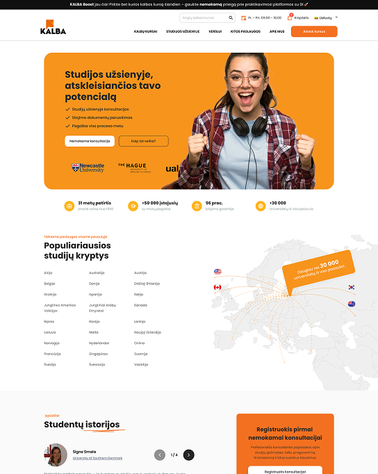
Studying abroad to unlock your potential

ABOUT THE CLIENT

Customer
Kalba
Field
Edukacija
Year
2024

KALBA – a leader in languages and studies abroad, operating in Lithuania for more than 30 years. It is an organization that helps people achieve their academic goals, gain better career opportunities, and successfully prepare for maturity and international exams.

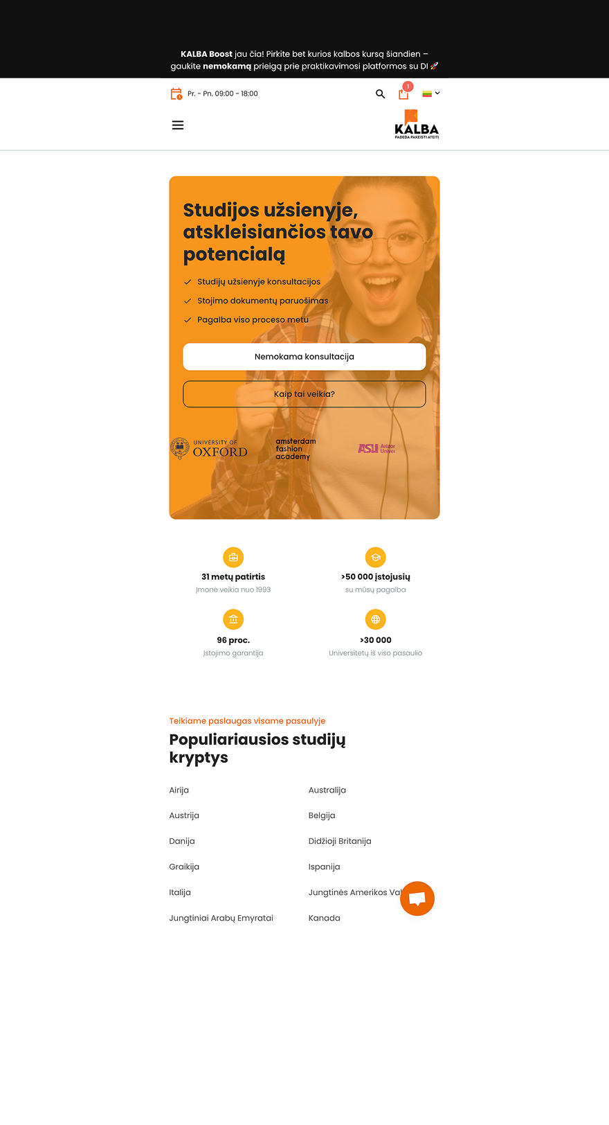
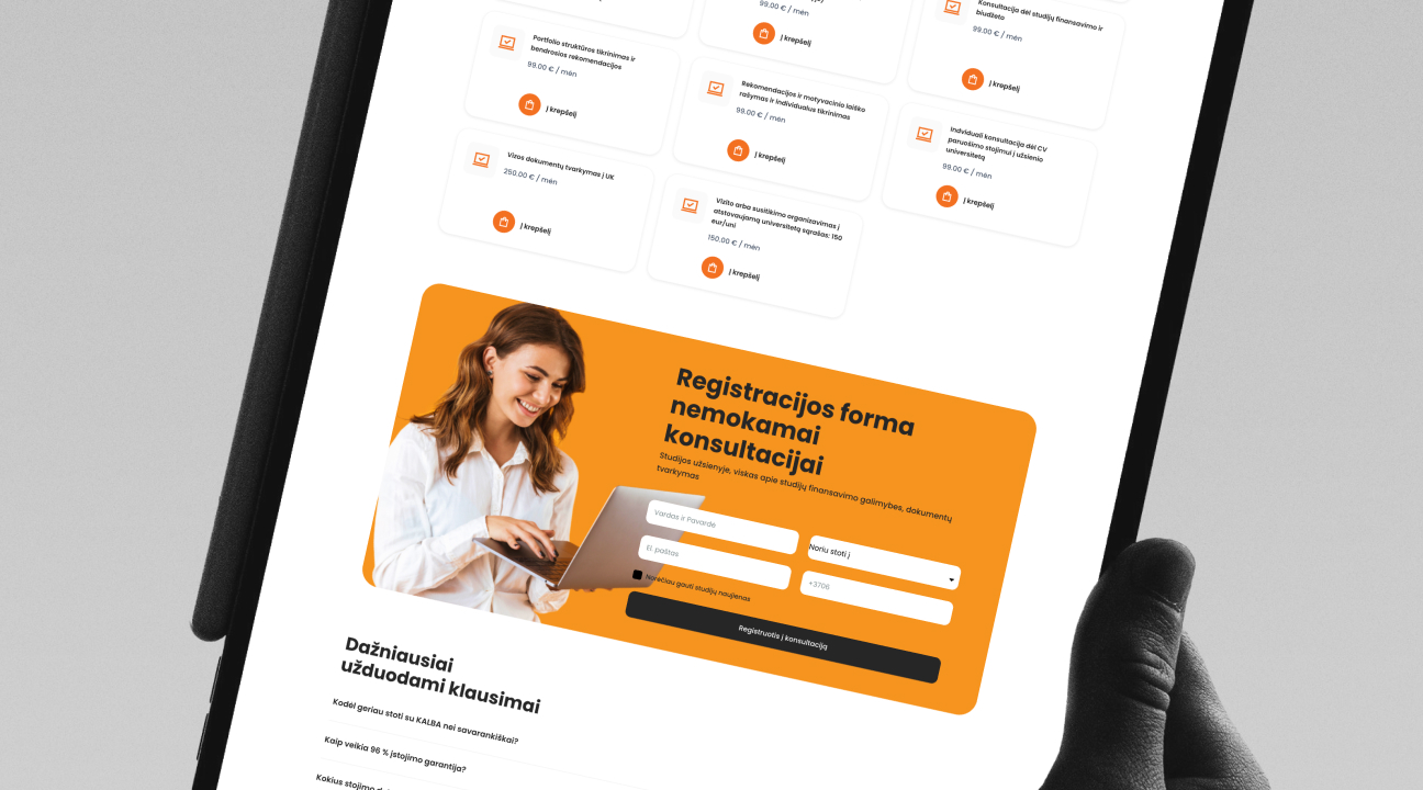
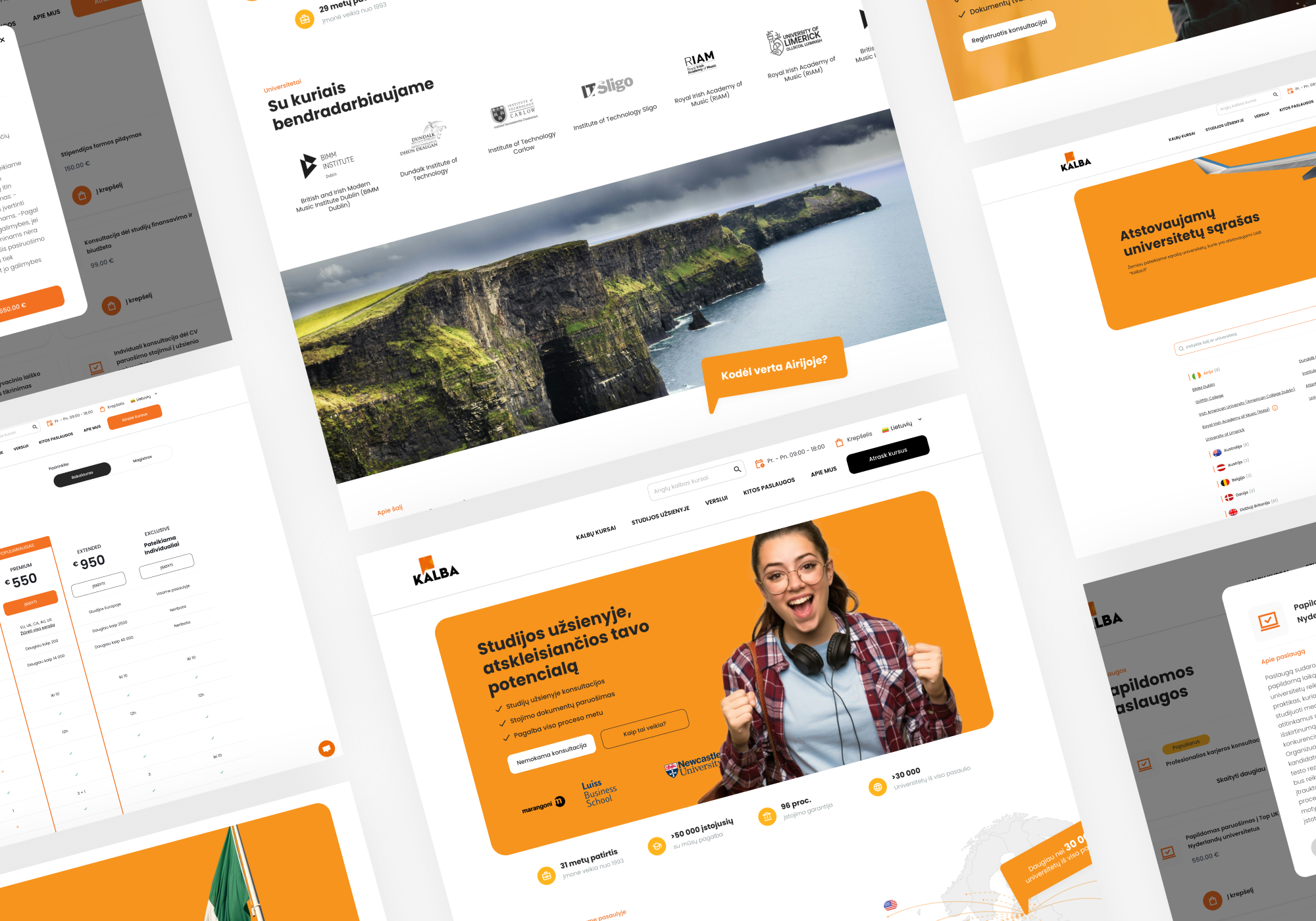
From a UX perspective, their digital space is very broad, multi-layered, and accommodates different services for different audiences: parents, pupils, students, adults, and businesses. That is why proper content layout, clear structure, and a professional image are extremely important.
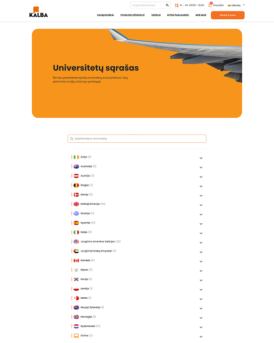
Challenge / Problem

Although KALBA had a functioning website, it no longer met modern UX standards and did not sufficiently reflect 30 years of recognition and professionalism.
Some of the pages were visually playful, with lots of flat illustrations, making it look more like a youthful school than a serious career partner.

  • The study abroad pages were difficult to scan, and the abundance of information obscured the true value of the services.
  • The list of universities was practically unusable: no filtering, inconvenient administration of three languages.
  • The price list did not communicate the value of the service – users did not see what they were paying for.
  • The old design did not convey a sense of professionalism, which is important for parents and students when making decisions.

The result: users asked how to find universities, what to expect from the service, and how the plans differed, while the marketing team lacked flexibility and speed on a daily basis.

Decision

We carried out a multi-stage UX transformation focused on clear content structuring and a professional, reliable visual tone.

  • UX redesign for studying abroad. We created a clearly scannable structure where all the most important sections are immediately visible. We updated the visuals – fewer illustrations, more professional, clean elements. We highlighted the value of the services through modern, functional block layouts.
  • UX for the list of universities. We created a new filtering system with a search function. We added country flags for faster visual orientation. We created automatic synchronization with documents – no manual updates in WordPress.

Decision

  • Pricing block. We created a new pricing logic with clearly outlined plan components. We highlighted the value proposition for each plan. Users can easily switch between bachelor’s and master’s plans.
  • The design remains modern, clean, visually close to the brand, but without excessive playfulness. The message has become clear: KALBA is not just a language school, but a partner for your career and studies.

Results

  • A significantly clearer user experience. Both parents and students now understand the logic of the services more quickly and can find prices and universities.
  • The price calculator began to communicate real value. The breakdown of the plan helped people understand what they were paying for.
  • Administration was simplified. Many things that were previously done manually are now added or changed in a matter of minutes.
  • The internal KALBA team provided a lot of positive feedback: “Looks great — good job!”
Phone frame
Phone screen content

Want to find out which solution is right for your business?

Let's talk – during a free consultation

Sign up for a free consultation
Want to find out which solution is right for your business?
Bright Projects
Privacy Overview

This website uses cookies so that we can provide you with the best user experience possible. Cookie information is stored in your browser and performs functions such as recognising you when you return to our website and helping our team to understand which sections of the website you find most interesting and useful.